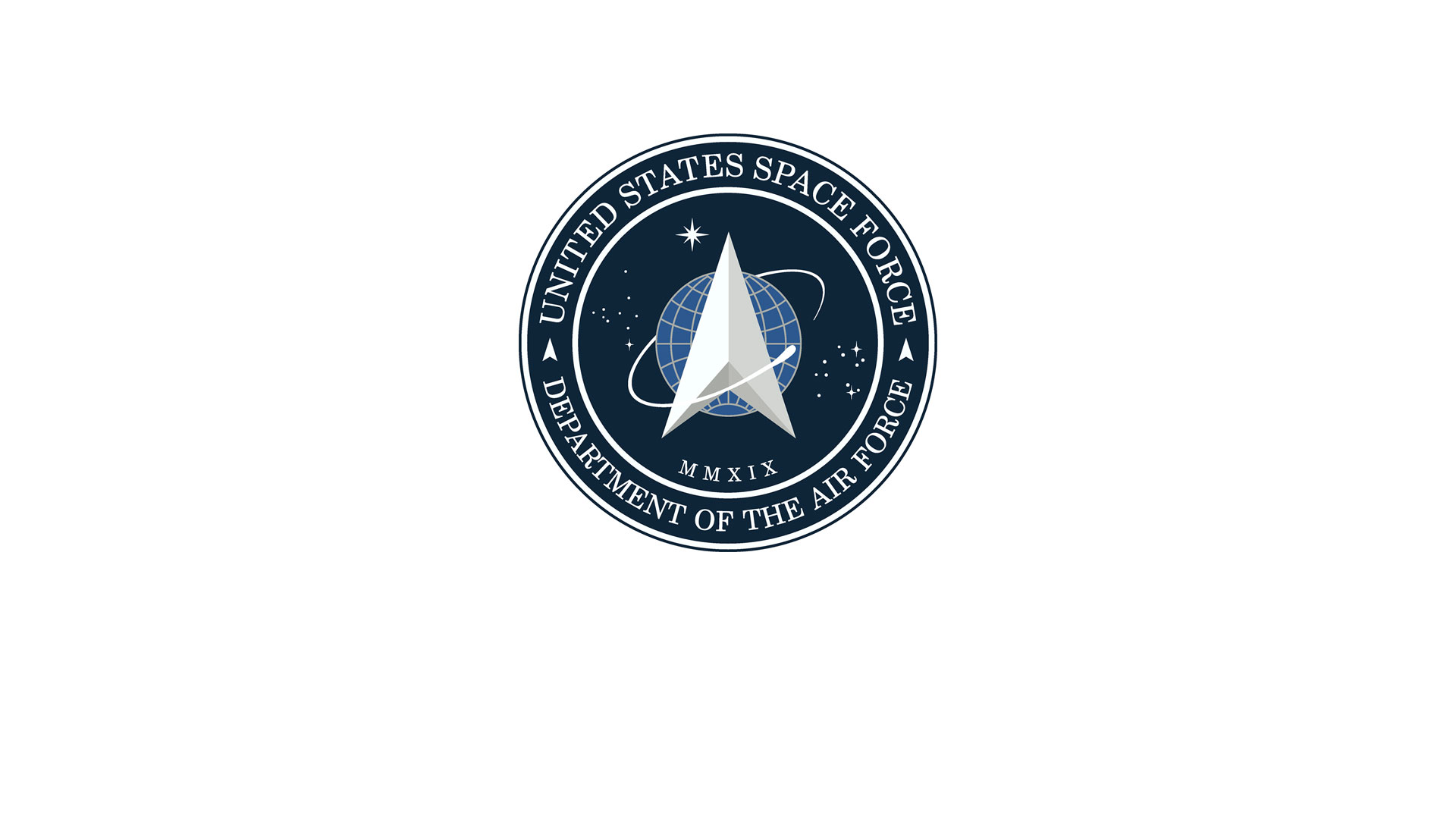
The United States Space Force logo deconstructed
President Trump unveiled the much-debated logo for the sixth and newest branch of the United States military services on Twitter, but what is it for and why does it look like this?
The new logo for the United States Space Force (USSF) has been unveiled.
In a tweet on Friday, President Trump revealed the logo which he said had been created after consultation with “Great Military Leaders, designers, and others”.
The USSF was created in December after Trump signed legislation to rename the United States Air Force Space Command and make it into a separate military entity.
After consultation with our Great Military Leaders, designers, and others, I am pleased to present the new logo for the United States Space Force, the Sixth Branch of our Magnificent Military! pic.twitter.com/TC8pT4yHFT
— Donald J. Trump (@realDonaldTrump) January 24, 2020
According to its mission statement, the USSF’s responsibilities include “developing military space professionals, and acquiring military space systems, maturing the military doctrine for space power, and organizing space forces to present to our Combatant Commands”.
Logo design
The dark blue seal has the organisation’s name wrapped around the circular logo, with an arrow-like ‘delta’ sign on top of a globe at its centre.
In a statement on Facebook, the USSF said: “The creation of the seal pays tribute to the newest Armed Service that organizes, trains, and equips space forces in order to protect U.S and allied interests in space and to provide space capabilities to the joint force.”
Many have pointed out the similarities between the new logo and the seal of the USS Enterprise, the fictional spacecraft from television show Star Trek. An actor from the show, George Takei, tweeted the two logos side by side with the caption: “There is nothing sacred any more.”
There is nothing sacred any more. pic.twitter.com/ubyy4OIZrp
— George Takei (@GeorgeTakei) January 24, 2020
In its statement however, the USSF notes that the central delta symbol has always been a “central design element in the seal”, first used by the U.S Army Air Forces in 1942. The sign has also been used in early Air Force space organisation emblems dating back to the 1960s, it said.
It is not known whether the logo was designed in-house or by an external agency. Design Week has reached out to the USSF for comment.
What do designers think?
I’d argue that Trump’s Space Force logo has already done its job, because it’s taken the debate out of the design world and into culture. The resemblance to the Star Trek badge has given the media a good chance to unleash plenty of “to boldly go” quips, plus some gleeful ridicule about the US President’s refusal to grow up — but at least the design is getting talked about.
Having said that, you might have hoped that we’d moved on from the mid-century space race aesthetic. Wouldn’t it be nice if Trump’s newly assembled ‘Sixth Branch of the Magnificent Military’ had advanced the conversation past the whole Buzz Lightyear ‘to infinity and beyond’ space ranger vibe? All those arrows piercing into the unknown feel a bit knobby to me, but maybe that’s the point.
Vicki Maguire, chief creative officer at Havas London
We eulogise these emblems and patches because of what they represent, rather than for their design credentials. As a consequence, we give them far more credit than they probably deserve — a lot of are glorified ‘clip art’ — and this is no different: quite literally, wearing its references boldly on its sleeve.
Design is a continuum. Nothing exists in a vacuum, and this mark naturally borrows from previous design tropes. Arrow heads have been a part of military insignia forever. The planet is reminiscent of the extinct PanAm emblem. The orbit and stars give a healthy nod to NASA’s meatball. And the delta no doubt takes a bit of inspiration from Star Trek which, in turn, took inspiration from early United States Air Force flight badges.
As with anything Trump-related, there’s a knee-jerk reaction to jump on the hater bandwagon. This mark isn’t great, but it’s also not as bad it could be. I’m sure it will sell a lot of merchandise and make huge amounts of money. What could be more fitting from the Trump presidency?
Lily Fletcher, strategy director at Accept & Proceed
At first glance, yes, the similarities are uncanny — but when we look at the logo in the context of its predecessor and the other five military branches, the story becomes more complete.
Ultimately the new logo is a move towards formality. The use of the roundel format and authoritative colour palette gives the previously, more cartoonish logo, a much stronger sense of gravitas. When considering the use of the delta symbol, denoting change, difference or ambiguity, its relevance becomes much more apparent. The satellite ring that encompasses suggests the conquering of this ambiguity — certainly an ambitious feat!
Another consideration is that in today’s visual language, this symbol could be seen as an indexical signifier of maps and location. While this is undoubtedly relevant to the theme of space voyaging, is it really the best indicator of space force? What I would argue is that this logo conveys the theme of space itself, using somewhat ubiquitous symbols. It moves towards stability and trustworthiness. Promising this level of control over something we know so little about is arguably quite ambitious!
It also seems difficult to believe that not one person involved in the USSF (presumably people with an interest in space and potentially science-fiction) failed to notice the resemblance to Star Trek. Perhaps a secret Trekkie couldn’t believe his luck when he actually managed to push this logo through to approval! Ultimately the logo is a result of amalgamating the old logo with the rest of the US Military branches, rather than stealing a beloved piece of pop culture. Who’s to say Star Trek didn’t draw some inspiration from the US Military back in the day?
Daniel Murphy, senior designer at Lewis Moberly
This is a funny one, both in the peculiar and laughing at senses, and beyond the is-it-isn’t-it issue of Star Trek plagiarism.
First up, it’s a funny-peculiar brief. Because how do you ‘brand’ something as grandiose and yet meaningless as ‘the command of outer space’? It comes without a visual vocabulary to pull from, so defaults as always to the overused visual tropes of mid-20th century science fiction.
Secondly, it’s funny in a sort of wry smile sense, because it reminds us how much authority is imbued by heraldry. Like, for example, how the Royal Warrant almost unknowingly delivers a believable officiality. And then obviously it’s funny ha-ha, as without that it simply looks made up. A fake club, delivering no sense of what they’ll actually do. The sort of thing a kid would draw in the side of a box then sit in it pretending they’re flying to Mars.
So yes, in summary, it’s a funny one. Boldly going nowhere meaningful at all.
Tom Munckton, creative director of design and branding at Above+Beyond
Whatever you think of Space Force, the fact remains that America has a renewed interest in extra-terrestrial innovation which, by any nerd’s standard, is no bad thing. To herald the launch (pun intended) of the first new branch of the military since 1947, the President himself revealed the new logo.
Herein lies the paradox: for something so ostensibly futuristic, why is the new logo so unapologetically retro? The design language is, as one would expect, an unironic composite of every other race-tracked, serifed, masculine logo currently being used by the largest military force on the planet. This is no surprise.
It’s the other design cues — the ones intended to make it unique — which are the elephant in the room. The central arrow has come to Space Force from NASA via the Star Trek logo (it originally appeared as a red chevron, reaching up past Earth towards the stars) before coming back to reality via the Air Force Space Command in the 1980s. So while every military on earth celebrates clichés such as eagles, bears, wolves and chest-beating mottos, it feels oddly hopeful that the American Military has stayed with Gene Roddenberry’s insignia of intergalactic and inter-racial cooperation. To some degree it’s this subtext and humour that helps to soften the macho semiotics. How Gene would feel about this re-appropriation (intentional or otherwise) is another matter.
So while its origins are entirely military, one can only hope the legacy of Space Force will be something that benefits humankind as a whole. And since this will be on pyjamas and baseball caps for generations to come, Star Trek’s message of inclusion and tolerance has never been more important.
Claire Parker, executive creative director at Design Bridge New York
What do you think about the new logo for the USSF? Let us know in the comments below.
Read this next

-
Post a comment


